Two years before Hungary’s TISZA Party rose to national prominence and went on to win the 2026 election, we had the chance to kickstart its visual identity.
A big part of that was typography and color. Which, in politics, is kind of everything. When every color, typeface and tiny visual decision gets read as a message, nothing is ever just decoration.
Politics is a strange place to design for because almost nothing stays neutral for long. Pick the wrong shade of red, choose a typeface that feels a bit too familiar, make something slightly too aggressive and suddenly people start reading into it. A political era, a party, an ideology you never meant to reference.
We needed something that didn’t feel historically loaded. Something that could bring a new visual voice into Hungarian politics, stand apart from the long-dominant Fidesz identity, but still feel credible, professional and somewhere near the European political center.
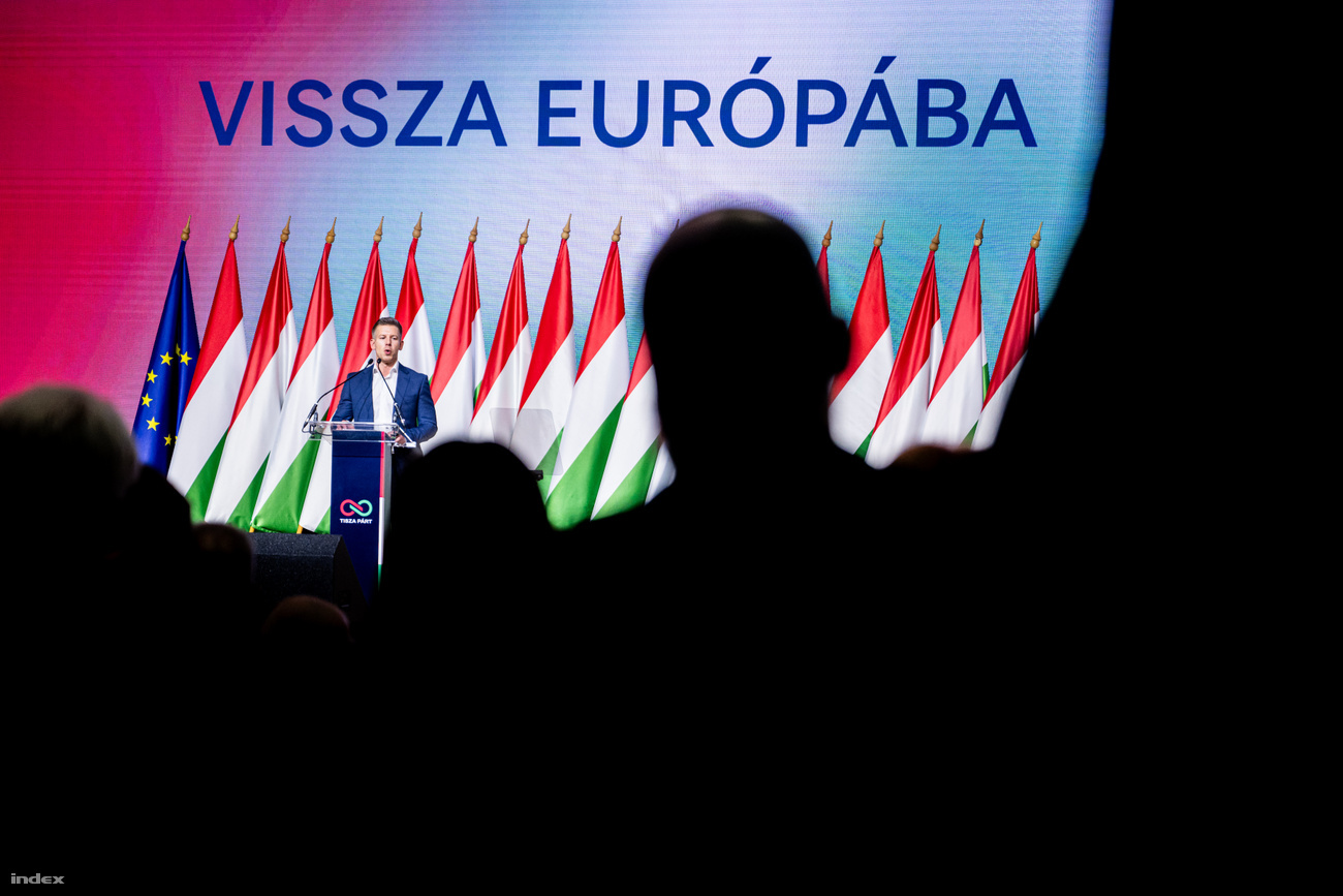
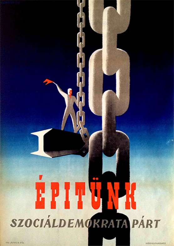
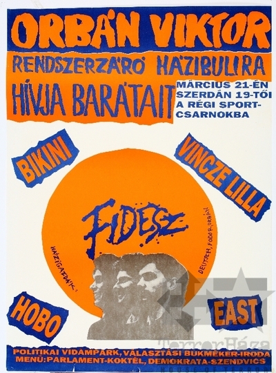
Hungarian political design comes with decades of visual associations. Red and condensed typography can evoke socialist-era communication, while hand-written, graffiti-style was used by early days Fidesz, where they wanted to project a youthful, anti-communist grassroots movement.
For a new political movement, these references can easily make an identity feel connected to an existing political tradition rather than something new.
So we had to find a typeface that felt fresh and recognizable, without reminding people too much of any previous political party or era.

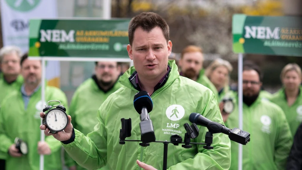
Green wasn’t exactly neutral territory either. In Hungarian politics it had already been claimed by LMP and environmentalist movements, and for part of the electorate, a consequence of years of Fidesz messaging and conflation, that visual world had become associated with the political left.
Choosing something more than blue. Blue fits perfectly representing democratic European, but here it has a dark history being used for Orbán's anti migration propaganda posters. We needed something more than blue, so we started experimenting with high fidelity gradients. A gradient can indicate fresh, and give a professional emerging tech startup vibe, thats what we needed. For the secondary color we wanted something light less serious professional looking so it can be easily use for community reasons.

Made to work across all kinds of surfaces, it visibly stands out in Hungary’s rusty political environment and makes you feel like something next-level is happening. We wanted something that felt sharper, more current, a level above what people were used to seeing. It had to feel tapped into what was already emerging from Hungarian communities: energetic, self-confident and ready for something new.After years of visual noise, cynicism and political communication and bad taste that often felt stuck in the past, we felt Hungarian people deserved something better.

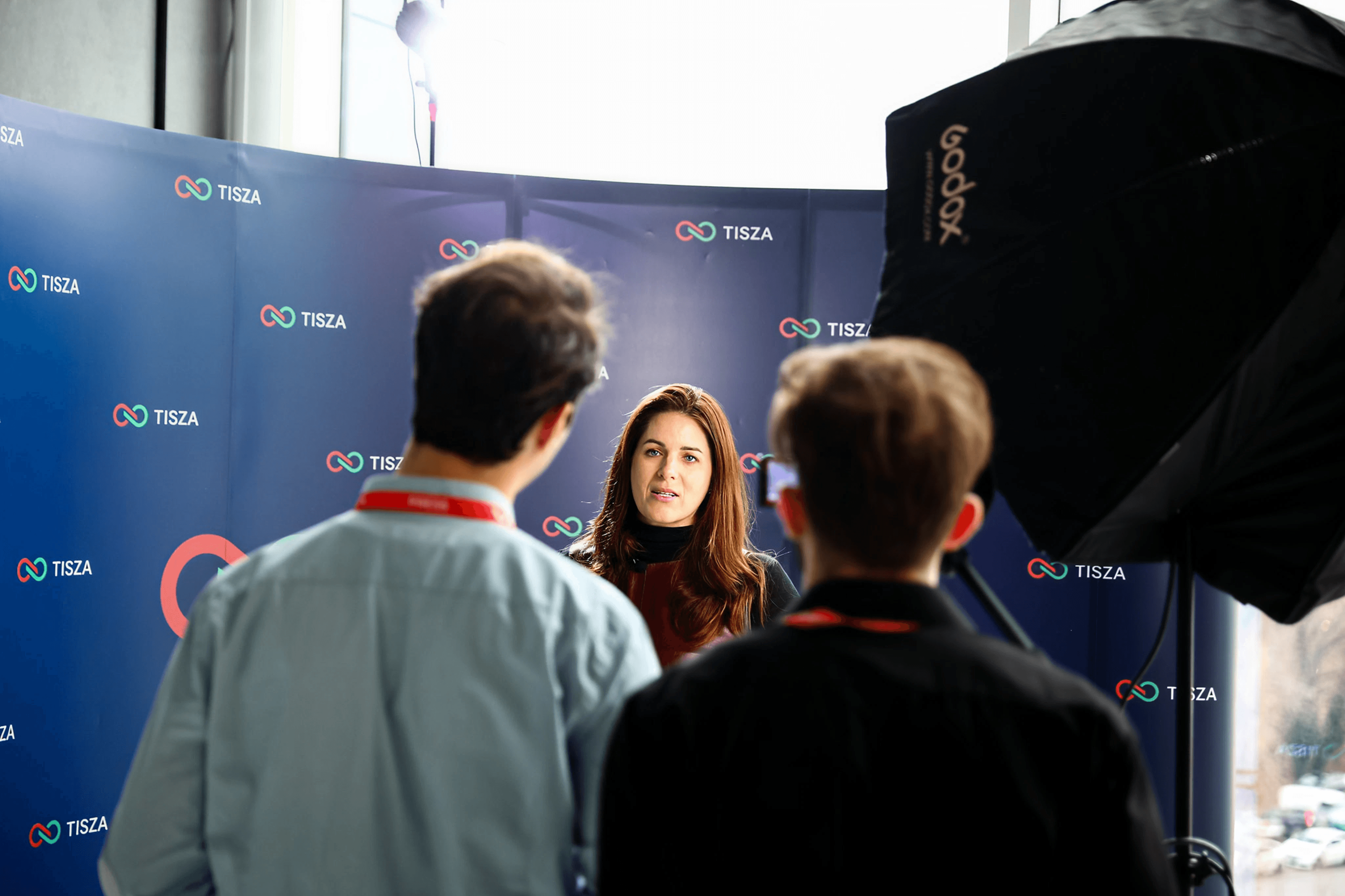
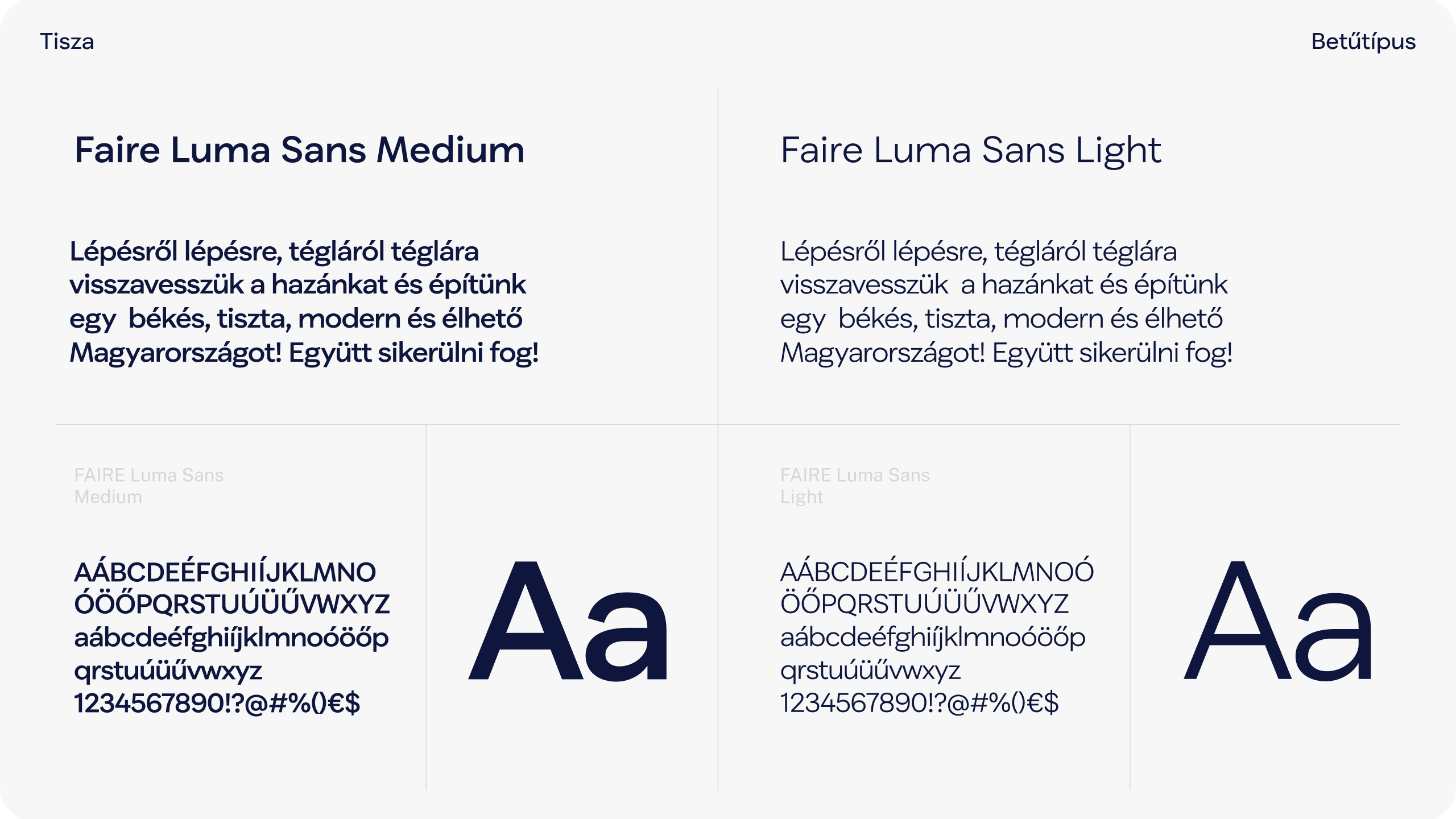
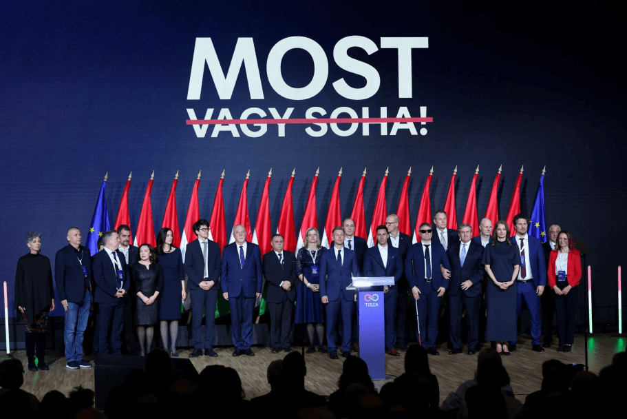
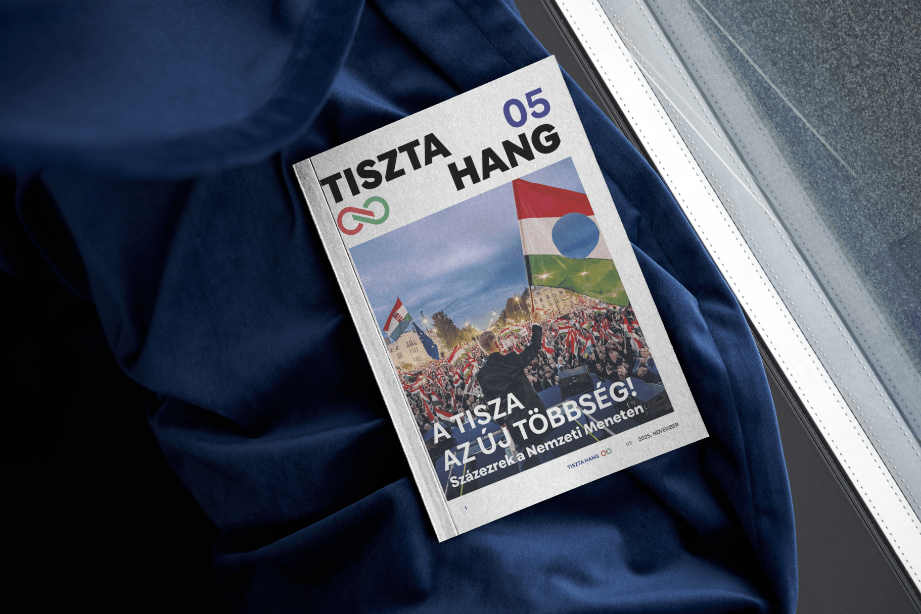
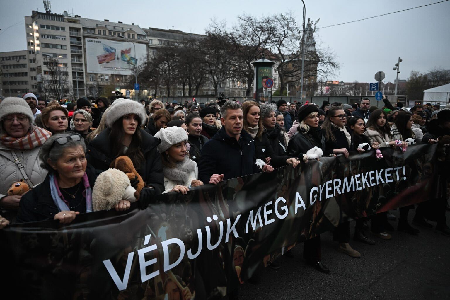
We selected Luma Sans as the core typeface for campaign communication, applying its geometric precision and humanized shapes across podium signage, social templates, posters, and long-form text. The choice reflects three core needs: Clarity and Readability, Modern Authority, and Multilingual Support. In TISZA’s typographic system, medium weights anchor headlines and calls to action, lending confidence to key messages. Lighter weights support policy summaries and longer prose without losing rhythm or readability. The result is a disciplined yet flexible visual voice that performs equally well in high-pressure public environments and digital spaces. By rooting its identity in a modern, human-centred sans-serif, TISZA reinforces its political narrative: an alternative grounded in clarity, openness, and pragmatism.